Understanding Vehicle Prevalence
In my last post we looked at the population of Honda Accords in New York. We calculated a few descriptive statistics and examined a few data distributions. This helped us get to know the Honda Accord population in New York but there’s a lot more we can do to understand this potential population of aftermarket part customers.
We now know the size of the Accord population but what about the rate of Accord ownership? Where are Accords popular or unpopular? Of course there are more Accords in the New York City metropolitan area where there are millions of people. But where do people own Accords at higher or lower rates? And how do these ownership rates compare with similar vehicles? This may help us avoid having too many or too few parts on the shelf in certain locations.
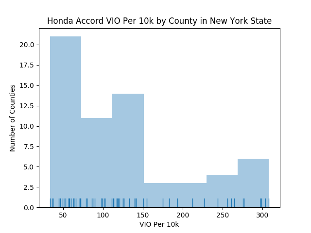
To understand the prevalence of Accords we can look at another histogram illustrating Accord VIO per 10,000 people. How is this metric calculated? It’s like a per-capita rate but adjusted to make it easier to interpret (because we’ll get a tiny fraction if we simply divide by population). So, we multiply by 1k, 10k or 100k to get numbers that are easier to understand and compare. Epidemiologists do this all the time when they’re comparing the prevalence of a particular disease or health condition between populations. In public health you’re more likely to see a rate per 100k people. It’s an arbitrary decision but, for our purposes, we’ll measure the number of Honda Accords per 10k population. In the histogram above you can see the distribution of Accord prevalence by county.
So, how does this prevalence rate for the Accord compare to other vehicles? To run a quick test I grabbed data for three other vehicles: Audi A4, Chevy Impala and Ford Fusion. Not perfect comparisons, I know, but will give us a general sense and maybe we’ll learn about consumer purchase patterns along the way.
First, let’s compare total populations. Here’s another one of those funny looking but extremely useful “swarm plots” from the Seaborn data visualization module for Python. Again, I like these swarm plots because it conveys the distribution like a box plot but every county is represented on the graphic so nothing is hidden behind aggregation.
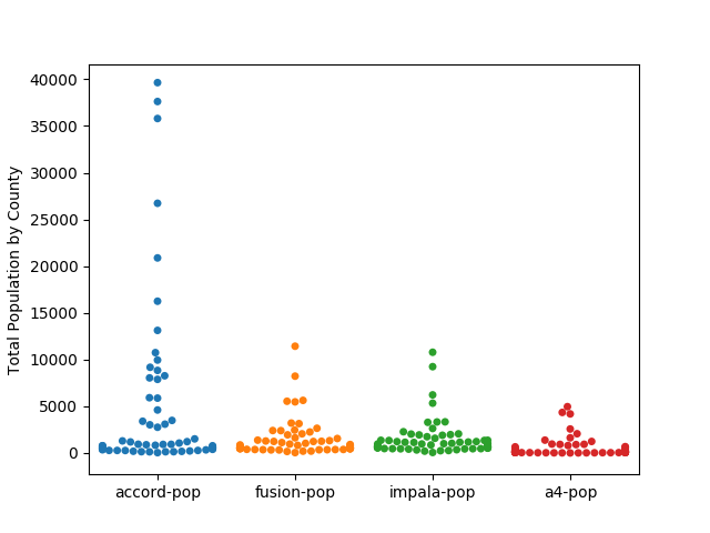
Looks like more Accords than the other three models. Okay, but how do these vehicles compare in terms of prevalence?
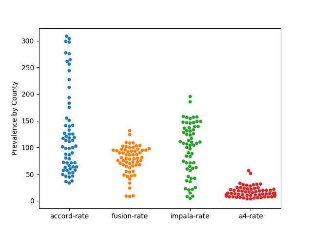
Now we see that Accords are not only more plentiful overall, they are owned at much higher rates compared to the Fusion, Impala and A4.
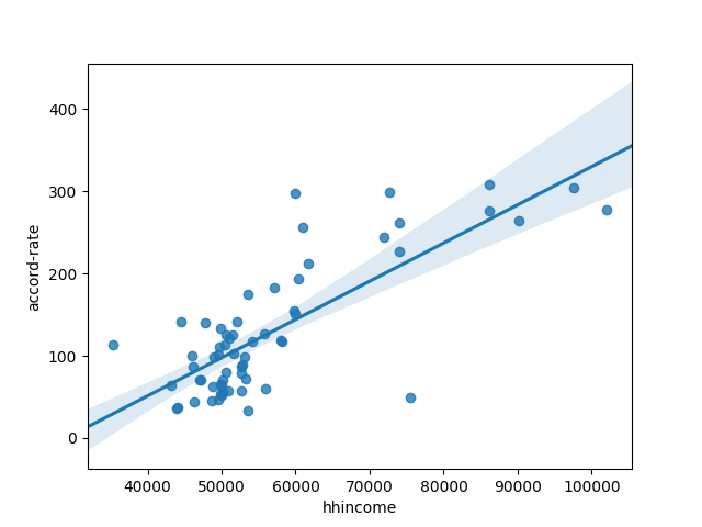
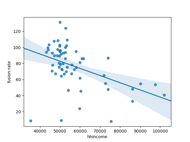
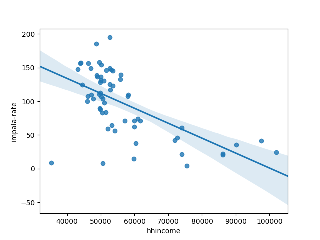
We might also want to look at correlation coefficients and perhaps scatter plots to see the relationships between ownership rates and other variables. Python makes it super simple to run a correlation analysis. Here are results for all vehicle populations and rates along with total population (of humans) and household income.
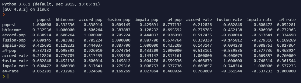
Reading a correlation matrix is sort of like reading the distance matrix they once published in road atlases so you could find out how long it would take to drive between various cities (yes kids, long ago maps were printed on paper and there were no sophisticated British voices to tell you where to turn or how much further you have to go). In this case you can find the pearson correlation coefficient for any pair of variables by locating the row and column where the two variables are compared. For example, if you look at household income (hhincome) in the second row (just below popest) and then scan to the right you’ll see that hhincome is positively correlated with Accord and A4 ownership rates and negatively correlated with Fusion and Impala ownership rates.
To dig deeper we can generate a few scatterplots to visualize individual relationships. 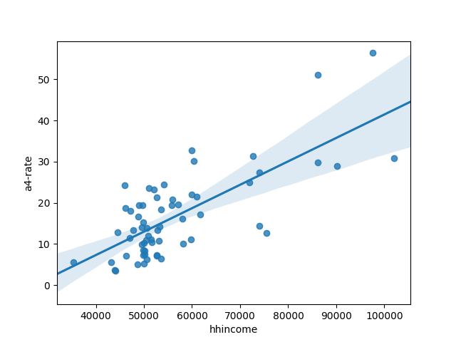
This process of looking for relationships between variables can be used to lay the groundwork for a regression model to predict/estimate vehicle populations. Like last time we could also look at the geographic distribution of ownership rates by making a few maps. But, if you’re still reading, you probably deserve a break so we’ll save the maps for another time.
In the meantime, here is some more Python code for those interested in replicating these graphics: https://repl.it/@justinholman/CompareSedans