How Many Honda Accords are there in New York?
This simple question is at the core of what VIO data are all about.
Imagine the entrepreneur who has invented an innovative aftermarket replacement part. The part might fit dozens of different models but, for the sake of a simple illustration, let’s say it only fits the Honda Accord. So, finding out the vehicle population is the same as finding out the size of the market for this new part. And this is the denominator in the equation to calculate market share. Pretty important number, explaining why companies are willing to spend money on VIO.
According to data we downloaded and processed from data.ny.gov, the answer to the question is there are approximately 300,000 Honda Accords in New York state.
Hey, why not give the exact number? Because all VIO data are estimates.
Even if we retrieve the data today, this minute, it would be just a static snapshot of registration records. New vehicle sales in the past month won’t show up. Recently purchased vehicles registered in a neighboring state won’t show up. Recently scrapped vehicles will still be counted. Occasionally people drive to another state and need a repair. Heck, some people register their vehicle in another state…for tax reasons or whatever. Sometimes vehicle registrations are clustered in a corporate or government office location even though the vehicles themselves are spread around the state or the country. It doesn’t matter how hard you try, the best count you can get is an estimate. If you’re thinking you’ll gain significant advantage from obtaining higher levels of precision you may be missing the mathematical forest for the trees.
To close the loop on the value VIO brings to marketing, this means that if you can capture 10% of the total market in any given year and sell a part for $100 then your total revenue would be: 300,000*10%*$100 = $3 million. Is that a sufficient return on required investment capital? That’s a good question for the entrepreneur to answer before beginning production. Anyway, hopefully you get the idea.
Now, this total vehicle population estimate is helpful but we also need to look at the “distribution” of county level vehicle populations. And I mean look, literally, at the data using a data graphic like the simple but mighty histogram.
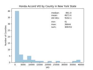
Do you see the “shape” by calculating median, mean, standard deviation or total sum? No, you have to visualize the spread of the data. This distribution is heavily skewed by the large, densely populated counties in and near New York City. Outside of NYC the population counts are much smaller. This won’t surprise anyone familiar with New York but not everyone is familiar with New York.
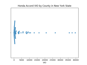
One way to see more detail is to add a “rug” to the histogram.

Now we can see that there are a whole bunch of counties with Accord VIO less than 1000 but this “rug” approach isn’t ideal because it’s difficult to make out every distinct county.
The data graphic below is called a swarmplot. I like this because it shows every data point (one dot = one county) and shows how many counties have really small Accord populations. Understanding this dynamic might be really important for production, distribution and marketing decisions.
By the way, if you like these graphics you can produce your own with the Seaborn module for Python. Here’s a link to data and code: https://repl.it/@justinholman/NY-HondaAccord. Over time we’ll be working new data graphics like these into the Inventory Analyst interface.
So now we have a much better understanding of the population data. But these data have a geographic dimension that needs to be understood as well. For this reason, you should also look at a map. The map doesn’t need to be fancy, it just needs to provide a better understanding of the spatial (geographic) dimension to your data. Seeing spatial and temporal resolution can be critical. This is part of getting to know your data. It’s like meeting someone at a cocktail party. We’re not yet ready to contemplate marriage. We’re just checking things out and getting to know each other. Reminds me of a John Cleese scene from The Meaning of Life. I won’t go there but you can.
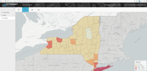
The map above is a screen capture from our recently released Inventory Analyst product. The map illustrates Honda Accord populations for each NY county with darker red shading indicating larger populations.
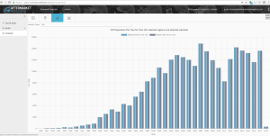
We also enable you to look at vehicles by age/year in histogram form to visualize one aspect of the temporal dimension. See the screen capture below, also from Inventory Analyst, showing the distribution of Accords by Year. Not difficult to spot the impact of the 2008 recession on new car sales.
Okay, we’ve taken a few measurements and looked at a few distributions. We’re starting to get to know the Honda Accord in New York. We could do much more but that’s enough for now. I’ll have more for you next week.
In the meantime, check out Inventory Analyst to see how easy it is to generate part-level demand estimates and shift your inventory into high gear.